

When you’ll need this
- Daily or weekly review: how many messages the AI received, how many inquiries it generated, and how many replies it sent.
- Message volume or customer feedback has changed, and you need to tell whether the shift sits in messages received, inquiries, or replies.
- You want to know what customers ask about most and which need category is the most concentrated.
- You want to drill from a high-share category into the raw records and review how the AI handled them.
How to get there
Left menu → Data Dashboard → Performance (this is the default page after sign-in, and the top bar shows the breadcrumb Data Dashboard → Business Performance). Once you are in, confirm two things first: the Statistics window at the top of the left sidebar decides which channel you are viewing, and the filter bar at the top decides which period.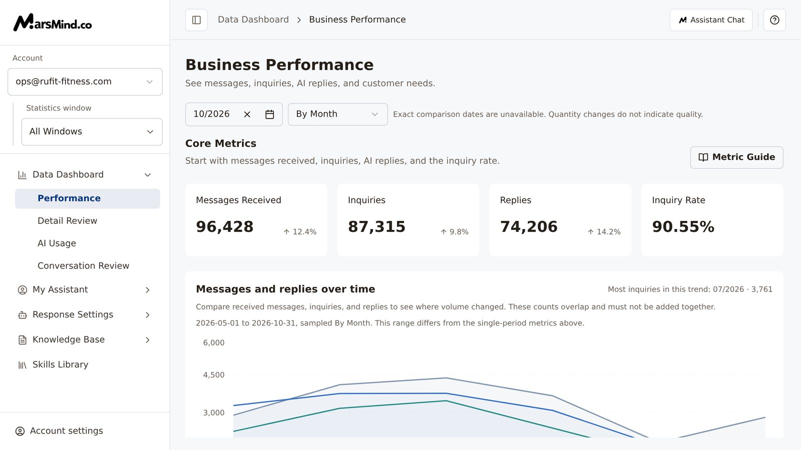
Steps
1
Set the reporting scope (window, account, time)
The scope comes from two places. Changes take effect immediately — there is no extra confirm button.
- Statistics window (left): choose the communication window you want to review, or All Windows for the combined view. Department admins also see an Account dropdown above it for switching to another member; everyone else only reports on their own account, and no Account dropdown is shown.
- Filter bar (top): choose the Time grouping first — By Day, By Week, By Month, or Custom (By Month by default) — then click the date button next to it to pick specific dates.
- By Week: clicking any day in the calendar selects the whole week it belongs to (Monday to Sunday).
- Custom: pick a start and end date; the range is limited to 2–31 days, and the data does not update until both ends are selected.
2
Read the core metrics (open Metric Guide any time)
Core Metrics has four cards: Messages Received, Inquiries, Replies, and Inquiry Rate. Their definitions: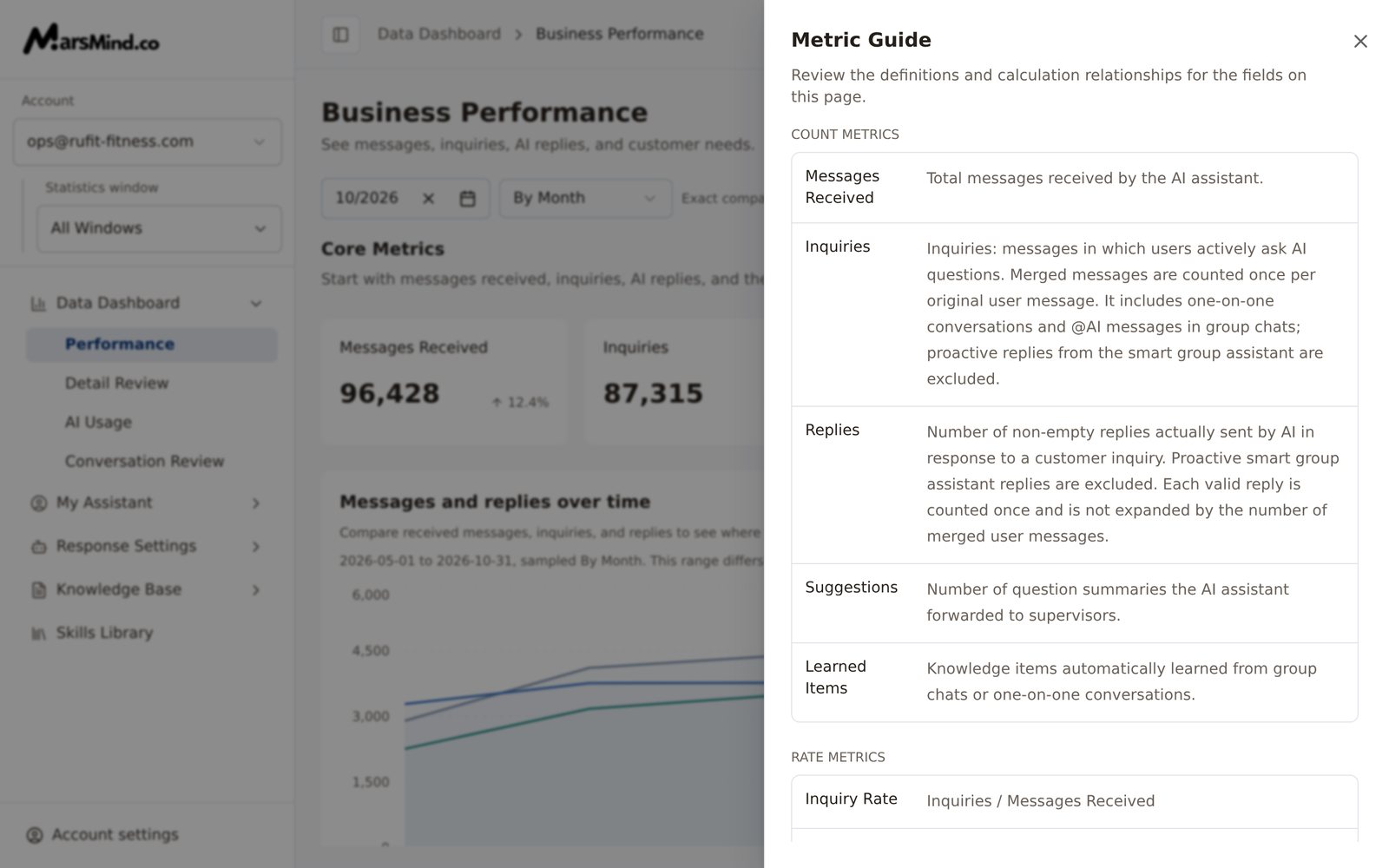
- Messages Received: the total number of messages the AI assistant received.
- Inquiries: messages in which users actively ask the AI a question. Merged messages are counted per original user message, and both one-on-one chats and @AI conversations in group chats are included; proactive replies from the smart group assistant are excluded.
- Replies: replies the AI actually sent with non-empty content, counting only replies triggered by a customer inquiry — each valid reply counts once. The smart group assistant and proactive replies are excluded.
- Inquiry Rate: Inquiries ÷ Messages Received.
3
Check messages and replies over time
Messages and replies over time plots messages received, inquiries, and replies as three lines, so you can see where volume started to change; the three lines overlap and must not be added together. When there is data, a label above the chart reads “Most inquiries in this trend: [date] · [count]”.
4
Check message activity by time
Message activity by time is a heatmap that answers one question: when during the day are customers most active. Each cell is one 3-hour period on one day — the darker the color, the more messages. Each cell counts raw messages, which is a different definition from inquiries.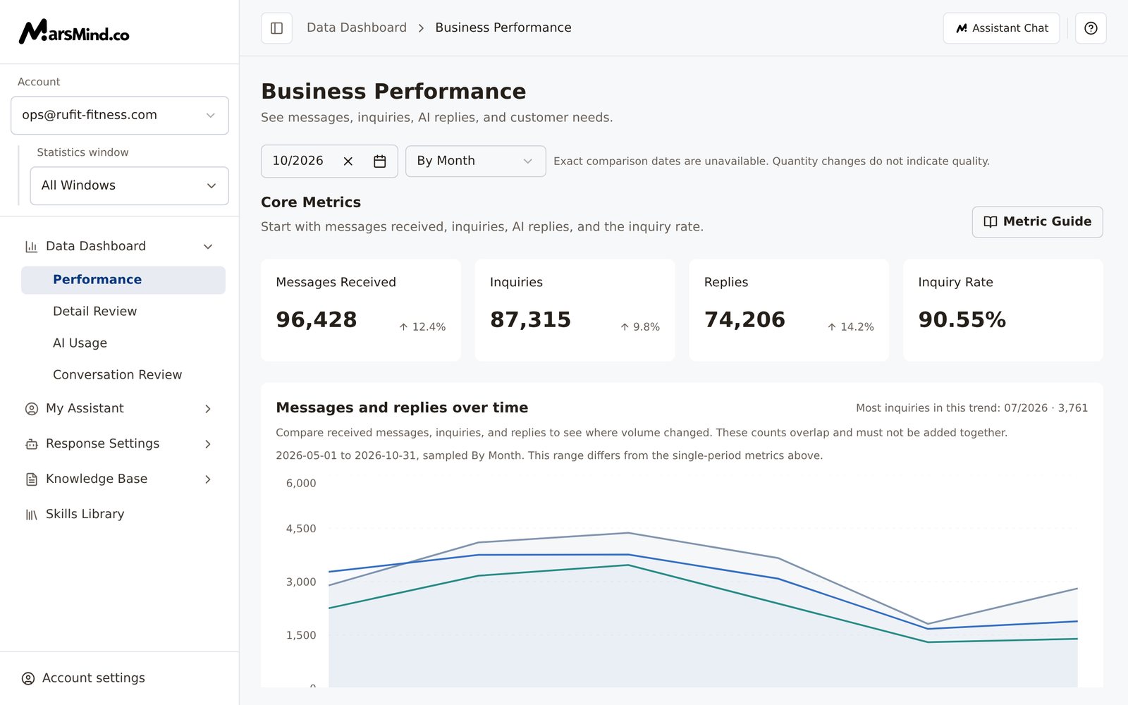
- Data follows the current account, Statistics window, and date range. When the selected period is longer than 31 days, only the last 31 days are shown (the card notes “Showing only the last 31 days of the selected period”), and times are displayed in Beijing time.
- The busiest period is labeled by default: “Busiest period” plus the date, time slot, and count. After you click any cell, the label switches to “Selected period”.
- When there are many dates or time slots, scroll sideways to see the full content.
5
Check rate trends and supporting metrics
Further down, Rate Trend has three cards: Inquiry rate over time, Replies per inquiry, and Adoption rate over time. Below those are Suggestions over time and Learned items over time, followed by four Supporting metrics cards: Suggestions, Learned Items, Replies / inquiries, and Adoption Rate.
- Replies / inquiries = Replies ÷ Inquiries. One inquiry can produce several replies, so the value can exceed 100% — it is not a reply success rate.
- Adoption Rate uses the value returned by the backend; its calculation is still awaiting confirmation, so do not judge service quality by it.
- Suggestions is the number of question summaries the AI forwarded to supervisors; Learned Items is the number of knowledge items the AI learned automatically from conversations.
6
Check business intents and activity rankings
The Business intents section contains, from top to bottom:
- What customers ask about: a donut chart counted by merged user intent turns — consecutive messages in the same intent count once. The chart header shows “[count] intent turns · [categories] categories”, and the summary below calls out the demand that is currently the most concentrated.
- Category display scope: the upper right defaults to “Hide other categories”; if the chart looks sparse, switch to “Show all categories”. This switch also applies to the main intents, the share change, and the detailed needs.
- Business category share change: compares two adjacent periods, each side totaling 100%. Bands connect only categories with the same name — they do not represent customer movement — and arrows show the change in share in percentage points. It does not support the Custom time grouping: when you pick Custom, the page says “Choose a daily, weekly, or monthly comparison”, and you can click “By Month” to switch; viewing the current day shows “No complete dates to compare yet”.
- Detailed customer needs: expands level 1 categories into level 2 intents; a longer bar means more turns.
7
Continue from the data
At the bottom of the page is Continue from the data. Click View records in this range to jump to Detail Review with the current account, communication window, and time range, and inspect each inquiry, AI reply, and processing path.How to tell it worked: after the jump, the date range in Detail Review matches this page.Note: when the date range is incomplete (usually because Custom has only one date selected), the button is disabled and the section shows “Select a complete date range first.”
Checkpoints
- The Statistics window on the left shows the channel you want to review (or All Windows); department admins should also confirm the Account.
- After you change the time grouping or dates, the core metrics, trends, message activity by time, and business intents all refresh together.
- Metric Guide lists all 5 count metrics and 3 rate metrics.
- Clicking any business category opens Detail Review with the matching date and category filters.
Statistics cover only AI-to-customer conversations; messages handled by human agents are not included.